Greenland Looks Bigger Than Africa on Almost Every Map You've Seen. It's a 450-Year-Old Navigation Trick, and It Still Shapes How We See the World.
On the world maps most of us grew up with, Greenland looks roughly the size of Africa. It is about 14 times smaller. The illusion comes from the Mercator projection, a map built for sailors in 1569 that drew compass bearings as straight lines at the cost of inflating everything far from the equator. Its descendants still power marine charts and the map on your phone, and for 50 years the distortion has been a political battleground. Here is how the trick works, why it persists, and why the fight over fair maps refuses to die.
On the world maps most of us grew up with, Greenland is a white giant stretched across the top of the globe, roughly the size of Africa. It is not. Africa's land area is about 14 times larger. Greenland, the world's largest island that is not a continent, is closer in size to the Democratic Republic of the Congo alone.
The illusion comes from the Mercator projection, published by the Flemish mapmaker Gerardus Mercator in 1569. It was a mathematical trick built for sailors: it draws lines of constant compass bearing, called rhumb lines, as straight lines, which made ocean navigation dramatically easier. The cost is that every landmass gets inflated the farther it sits from the equator. The map was a breakthrough for the age of sail, and its descendants still power marine charts and the map on your phone. But the distortion never went away, and for the past 50 years it has been a political battleground over what a map should tell you about the world.
The map built for sailors
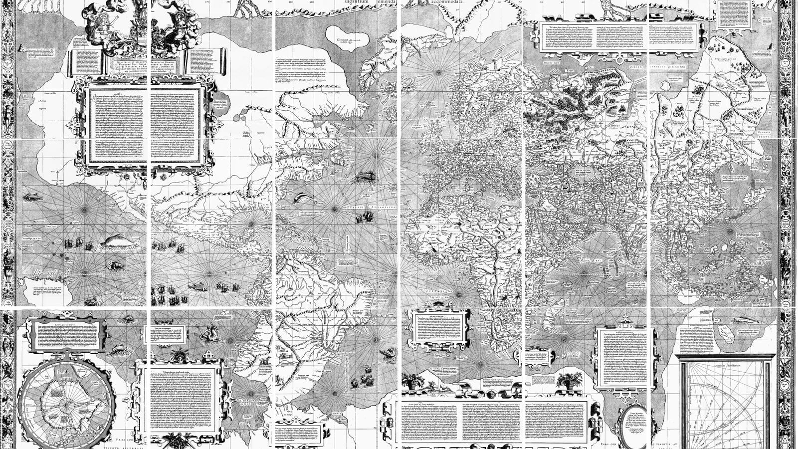
Gerardus Mercator was one of the great mapmakers of the 1500s, a Flemish scholar working in Duisburg when he published his world map in 1569. Its full Latin title, Nova et Aucta Orbis Terrae Descriptio ad Usum Navigantium Emendate Accommodata, translates roughly as "new and more complete representation of the terrestrial globe, properly adapted for use in navigation." The title says exactly what the map was for.
In the age of sail, the hard problem was course plotting. A ship steering a constant compass bearing, say northeast, traces a spiral path on a globe called a rhumb line, a loxodrome. On ordinary maps, that constant bearing looks like a curve, so plotting a course meant fiddly geometry with dividers and charts. Mercator arranged his projection so that every rhumb line became a straight line, and every compass bearing crossed the map at the same angle it crossed the globe. A navigator could simply draw a straight line between two ports and read off the bearing. It was the most useful innovation in nautical charting since the compass itself.
The map was not the whole world, notably. It showed latitudes from about 66 degrees south to 80 degrees north, leaving the polar regions out entirely, a decision that would matter later.
How the trick works
Picture wrapping the globe in a cylinder of paper, with the equator wrapped around its middle, then projecting the Earth's surface outward onto the paper and unrolling it. That is the family of cylindrical projections, and Mercator's version has one special property: it is conformal, meaning it preserves angles and shapes locally. A square island stays a square, a compass bearing stays true. To achieve that, the map stretches distances vertically at exactly the same rate it stretches them horizontally, and that stretch grows without bound toward the poles.
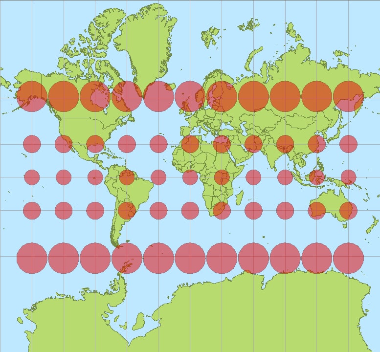
The result is visible in any Mercator map. Around the equator, landmasses are close to their true relative size. Move north or south, and everything inflates. The distortion is quantified with a tool called Tissot's indicatrix: draw equal-size circles on the globe, project them, and watch them grow. On a Mercator map they remain perfect circles, the signature of a conformal projection, but they balloon as they approach the poles, marking where the map's promises break down.
What the distortion does to the world
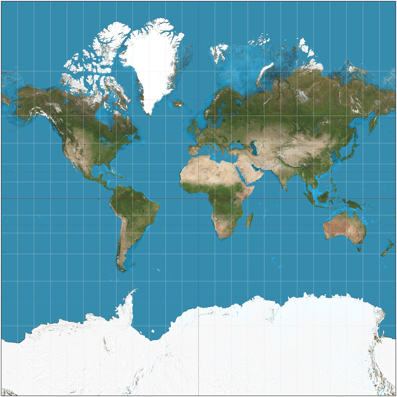
The classic example is Greenland versus Africa. On a Mercator map, Greenland looks comparable to Africa, but Africa's 30.4 million square kilometers dwarf Greenland's roughly 2.2 million, a factor of about 14. Antarctica gets the worst of it: a continent of about 14 million square kilometers appears as a white wall across the entire bottom of the map. Alaska looks bigger than Brazil on many Mercator maps, though Brazil has more than four times Alaska's area. South America is drawn at roughly the size of Europe, when in reality it is nearly twice as large. And Germany, because publishers often cropped off Antarctica and recentered the map, appears to sit much farther north than it does on a globe.
The effect is not an error in the usual sense. Mercator's map does exactly what it was designed to do: preserve bearings and shapes for navigation. The inflation is the price of that property, a trade-off, not a mistake. Every flat map of a round planet makes some compromise, and the interesting question is which compromise each one makes.
The map on your phone
Mercator never left. Marine charts still use a version of it, because navigators still want rhumb lines straight. And when digital maps arrived, the projection found a second life: web maps from Google and OpenStreetMap use Web Mercator, a spherical variant of the same idea, because it keeps the geometry simple and lets street grids render with their angles intact.
That last point is why Google Maps used it for so long. A Google employee explained in 2009 that the first version of Maps did not use Mercator, and streets in high-latitude cities like Stockholm did not meet at right angles on screen the way they do on the ground. Mercator fixed that.
But the same inflation carried over. For years, zooming all the way out of Google Maps showed a flat world where Greenland looked enormous. In August 2018 the company changed course: it introduced a 3D globe mode for the desktop app, announcing on Twitter that "Greenland's projection is no longer the size of Africa." The mobile app stayed flat for a while longer, and the globe was a quiet admission that the old map had been teaching the wrong lesson at the global scale.
The map that started a fight
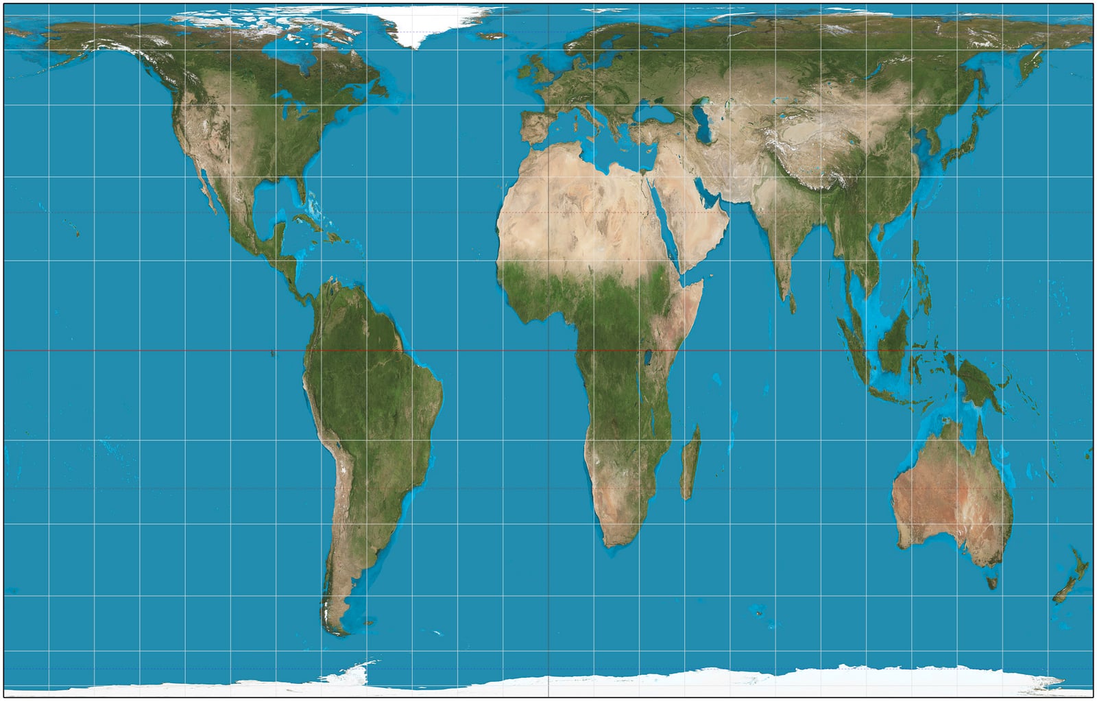
In the 1970s, a German historian and filmmaker named Arno Peters decided the Mercator projection was misleading and unjust. His argument: by inflating Europe and North America and shrinking the tropics, the standard world map made the rich world look bigger than the poor world, and that visual lie had shaped how generations saw global power. He promoted an equal-area alternative, a projection where every region keeps its true relative size, as the "Peters world map," a fair map to correct the record.
There was a catch. The projection Peters presented had actually been described a century earlier by the Scottish clergyman James Gall, who presented it in 1855 and published it in 1885, which is why it is now known as the Gall-Peters projection. And Peters' salesmanship outran the facts: he claimed his map was the only area-correct map, which is false, since equal-area projections had existed for centuries, and he claimed it had no extreme distortions of form, which is also false, since equal-area maps stretch shapes badly. The Gall-Peters projection is accurate about areas and rough on everything else: Africa keeps its true size, but continents near the equator are drawn tall and narrow, and the familiar shapes we recognize are distorted.
Cartographers pushed back hard. The American Cartographic Association, whose 1986 pamphlet gave the projection its name, spent years explaining that no single flat map can be right about everything, and that Peters had dressed up a trade-off as a moral correction. The argument even reached popular culture: an episode of The West Wing had characters argue for the Peters map in schools, claiming the Mercator had "fostered European imperialist attitudes for centuries." The Mercator projection was adopted by socially concerned organizations, including the National Council of Churches and the magazine New Internationalist, and in 1989 and 1990 a group of North American geographic organizations passed a resolution rejecting all rectangular world maps, a category that includes both Mercator and Gall-Peters. The two camps never really reconciled.
Boston changes its maps
The debate stopped being academic in March 2017, when Boston public schools announced they were phasing in the Gall-Peters projection for new classroom maps, in what administrators described as part of a three-year effort to decolonize the curriculum. Teachers put the old and new maps side by side and watched students react. "Interesting to watch the students saying 'Wow' and 'No, really? Look at Africa, it's bigger,'" said Natacha Scott, then director of history and social studies for the district. Colin Rose, assistant superintendent, called it a paradigm shift: "The Mercator projection is a symbolic representation that put Europe at the center of the world. And when you continue to show images of the places where people's heritage is rooted that is not accurate, that has an effect on students."
The decision drew sharp criticism from cartographers, who pointed out that the Gall-Peters projection has its own serious distortions, and that replacing one flawed map with another was not the fix it was sold as. The district said it was believed to be the first public school system in the US to adopt the map, and that existing Mercator maps would not be removed, only new purchases would use the Peters projection.
The Boston episode is the whole controversy in miniature: a real, dated decision driven by a real critique, met by a real technical objection. Both sides had a point, and neither projection settled it, because projections cannot settle political arguments.
The modern answer
Half a century after Peters, the search for a better classroom map continues. In the 1990s, Arthur Robinson designed a compromise projection that balances shape and area distortion, which NPR noted was created to address the "Greenland problem." More recently, a team of cartographers released Equal Earth, an equal-area projection designed to look familiar while keeping continents in true proportion. In 2025, the African Union threw its support behind a push to replace the Mercator map with Equal Earth, arguing that the standard map's distortion of Africa's size is a lasting colonial artifact. It is the same fight Peters started, with better math and better manners.
Fritz Kessler, a Penn State geography professor and map projection expert, told NPR in January 2026 that the whole argument misses the point: which projection you pick depends on what you are using the map for. "Is it going to be used to measure distances or directions? Angles? Areas? Show distributions of thematic data?" he said. "There's hundreds of projections that can be used, and the fact that we focus on just a very narrow subset is I think another problem that should be addressed."
The Greenland illusion is not going anywhere. The map on your phone still descends from Mercator, marine charts still use it, and every time Greenland is in the news, the question of its true size resurfaces, as it did in January 2026 when NPR revisited the territory's real dimensions amid renewed talk of annexation. But the next time a map makes Greenland look like a continent, it is worth asking what job that map is doing. Every flat map lies. The useful question is which lie it tells, and why.
Sources
- Wikipedia: Mercator projection - the projection's properties, 1569 date and Latin title, rhumb lines, size distortion examples, Tissot's indicatrix, Web Mercator
- NPR (January 7, 2026): How large is Greenland, really? Your map may be deceiving you - the 2026 hook, Greenland's 836,000-plus square miles, the 14x Africa figure, Fritz Kessler's expert comments, Robinson and Equal Earth, the African Union's 2025 campaign
- Wikipedia: Gall-Peters projection - Gall's 1855 presentation and 1885 paper, Peters' 1970s campaign, the inaccurate claims, the 1989-90 resolution, the projection's naming
- The Guardian (March 19, 2017): Boston public schools map switch aims to amend 500 years of distortion - the Boston decision, the decolonization framing, Natacha Scott and Colin Rose quotes, cartographers' objections
- The Verge (August 5, 2018): Google Maps now depicts the Earth as a globe - the 3D globe mode, the "Greenland's projection is no longer the size of Africa" announcement, the 2009 Stockholm streets explanation
Hero image: Gerardus Mercator's 1569 world map, public domain via Wikimedia Commons. Inline images: Tissot's indicatrices diagram (CC BY-SA 3.0), Mercator projection world map built from NASA Blue Marble imagery (CC BY-SA 3.0), and the Gall-Peters projection map (CC BY-SA 3.0), all via Wikimedia Commons. All images are freely licensed for reuse with attribution.
Related on Impossible Universe
- Satellites Power Down When They Cross This Patch of the Atlantic. It's a Dent in Earth's Magnetic Field, and It's Growing. - how scientists map Earth's magnetic field, and what the maps can and cannot tell us
- A Lost Maya City Was Found Hidden in the Mexican Jungle. It Survived 1,000 Years Undisturbed. - LiDAR maps that reveal landscapes no one knew were there
- A Civilization of Up to 3 Million People Carved Geometric Earthworks Across the Amazon. A New LiDAR Survey Shows How Many Are Still Hidden. - more hidden landscapes, found with mapping technology